Display
堆叠卡片
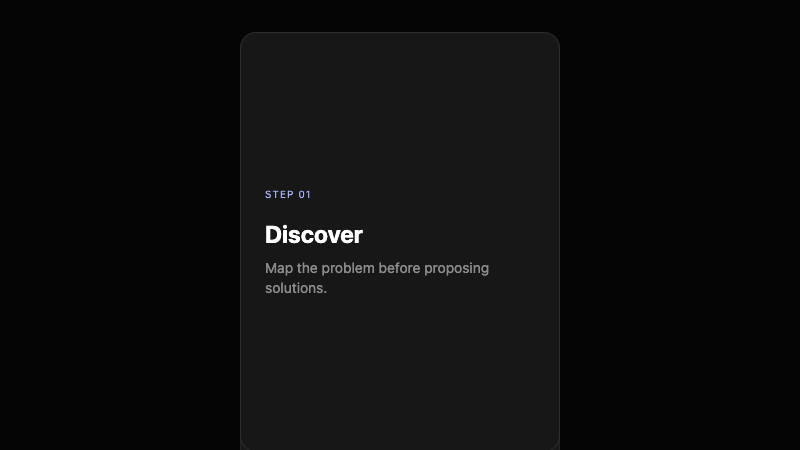
一堆卡片在滚动或交互时展开或扇形展开。
作者:mcpSkills
框架
nextjs
UI 库
shadcntailwind
难度advanced
英文提示词
Create a stacked cards component with 5 cards. The cards should be piled with slight vertical offsets and shadows, showing only the top edges. On scroll or click, the cards fan out vertically with staggered rotation, revealing their full content. Use CSS transforms, transitions, and z-index layering. Use Tailwind CSS. Each card can have a dark background, small title, and one-line description.
中文提示词
创建一个堆叠卡片组件,包含 5 张卡片。卡片应轻微垂直偏移和阴影堆叠,只显示顶部边缘。滚动或点击时,卡片垂直扇形展开并错开旋转,展示完整内容。使用 CSS transforms、transitions 和 z-index 分层。使用 Tailwind CSS。每张卡片可有深色背景、小标题和一行描述。
## Overview
将列表变成可触摸、可揭示堆叠的趣味卡片交互。适合功能、FAQ 或流程步骤。
## Features
- 5 张堆叠卡片
- 垂直偏移 + 阴影
- 滚动/点击扇形展开
- 错开旋转
- z-index 分层
- 深色卡片表面
## Usage
适用于功能列表、分步流程或交互式 FAQ。
## Customization
修改 prompt 以:
- 改为水平扇形展开
- 悬停触发展开
- 为卡片添加图标或数字
- 包含进度指示器