UI Components
分段控制器
带有滑动激活背景和精确触觉反馈的胶囊形分段控制器。
作者:mcpskills
框架
reacttailwind
UI 库
form
难度intermediate
英文提示词
Create a premium segmented control component. The container is a soft gray (gray-100) rounded-full pill with a 1px gray-200 border. Inside are 3-4 equal-width segments with labels like 'Day', 'Week', 'Month', 'Year'. The active segment has a white background, a subtle shadow, and rounded-full shape, and the active indicator should slide smoothly between segments when selection changes (use transform transition). Inactive segments use gray-500 text. Show a small example below the control, such as a chart or stats, that subtly updates when the segment changes. Use clean sans-serif type, no emojis, only simple SVG or no icons. The whole component should feel tactile and precise.
中文提示词
创建一个高级分段控制器组件。容器是一个柔和的 gray-100 rounded-full 胶囊,带有 1px gray-200 边框。内部有 3-4 个等宽分段,标签如 'Day'、'Week'、'Month'、'Year'。当前激活分段具有白色背景、柔和阴影和 rounded-full 形状,切换选择时激活指示器应平滑滑动(使用 transform 过渡)。未激活分段使用 gray-500 文字。在控制器下方展示一个小示例(如图表或统计),分段切换时示例会微妙更新。使用简洁的无衬线字体,不使用 emoji,仅使用简单 SVG 或不使用图标。整体应具有触感和精确感。
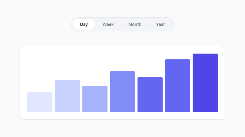
Pill-shaped segmented control with sliding active background.