UI Components
涟漪按钮
具有从点击点向外辐射的材质风格涟漪效果的按钮。
作者:mcpskills
框架
reacttailwind
UI 库
button
难度intermediate
英文提示词
Create a premium ripple button component. The button is medium-to-large, rounded-lg or rounded-full, with a solid indigo-600 background and white text. On click, a circular ripple wave radiates outward from the exact click point, using white/30 that fades and scales up to 2-3x before disappearing. The ripple should support multiple simultaneous clicks. Add a subtle hover lift and shadow. Show a few variants in a row: filled, outlined, and ghost. Use no emojis, only CSS/JS animations. The background should be a soft gradient or light neutral surface. Make the interaction feel responsive and tactile.
中文提示词
创建一个高级涟漪按钮组件。按钮为中到大尺寸,rounded-lg 或 rounded-full,实心 indigo-600 背景和白色文字。点击时,从精确的点击点向外辐射圆形涟漪波纹,使用 white/30 颜色,逐渐淡出并放大到 2-3 倍后消失。涟漪应支持多次同时点击。添加微妙的悬停上浮和阴影。在一行中展示几个变体:实心、描边和幽灵。不使用 emoji,仅使用 CSS/JS 动画。背景应为柔和渐变或浅色中性表面。让交互感觉灵敏且有触感。
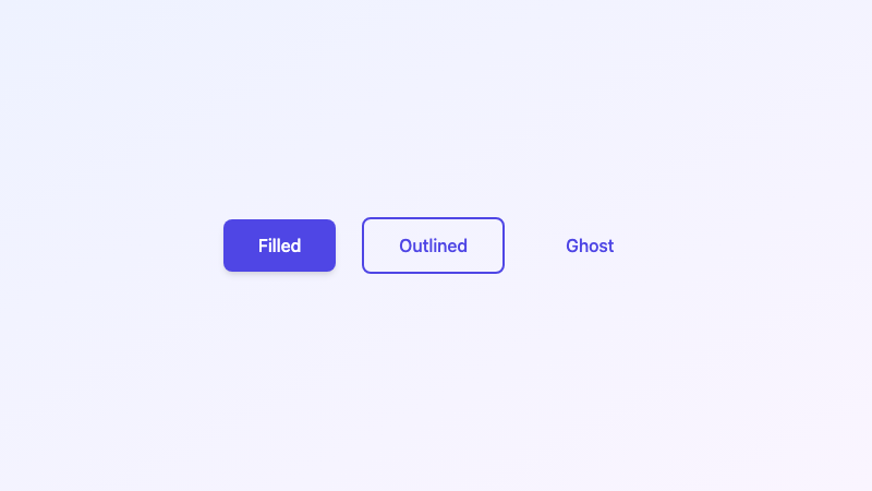
Button with material-style ripple radiating from the click point.