UI Components
验证码输入框
具有六个独立单元格、聚焦环和细微错误抖动的一次性密码输入框。
作者:mcpskills
框架
reacttailwind
UI 库
form
难度intermediate
英文提示词
Create a premium one-time password (OTP) input component. Display six square cells in a horizontal row with equal gaps on a clean white or light gray background. Each cell is a rounded-lg box with a 1px gray-300 border and centered text. The focused cell shows a 2px indigo-500 border and a soft blue glow shadow. As the user types, the caret automatically moves to the next cell. Show a filled state with numbers in each cell and a small success message below with a checkmark SVG. Add an error state where all cells shake horizontally and turn red-bordered with a red error message. Include a 'Resend code' link in muted text below. No emojis, use SVG for icons.
中文提示词
创建一个高级一次性密码(OTP)输入组件。在干净的白色或浅灰色背景上水平排列六个方形单元格,间距相等。每个单元格是 rounded-lg 方框,带有 1px gray-300 边框和居中文字。聚焦的单元格显示 2px indigo-500 边框和柔和的蓝色发光阴影。用户输入时,光标自动移动到下一个单元格。展示一个填充状态,每个单元格都有数字,下方显示带勾选 SVG 的成功信息。添加错误状态,所有单元格水平抖动并变为红色边框,下方显示红色错误信息。底部包含一个浅色文字的 'Resend code' 链接。不使用 emoji,图标使用 SVG。
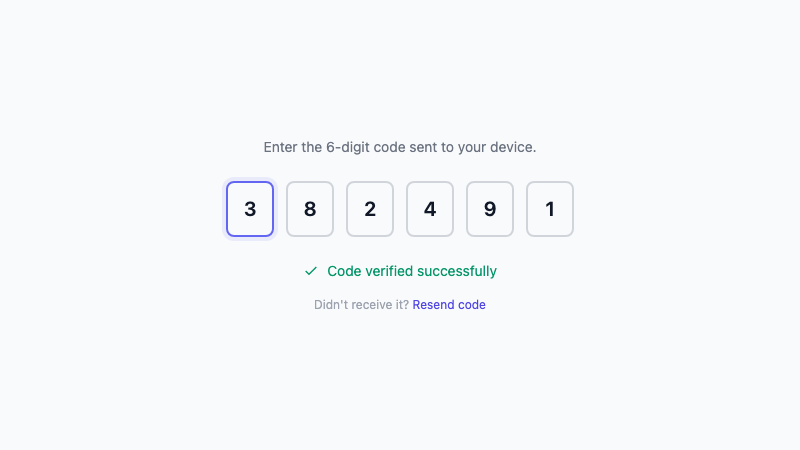
Six-cell OTP input with focus rings and error shake animation.