UI Components
Toast Stack
A stack of notification toasts with progress bars, icons, and entrance/exit motion.
by mcpskills
Framework
reacttailwind
UI Library
feedback
Difficultyadvanced
English Prompt
Create a premium toast notification stack anchored to the top-right of a light background page. Show 3 stacked toast cards with subtle shadows, rounded-xl white backgrounds, and 1px gray borders. Each toast has a left accent strip (green for success, indigo for info, amber for warning), a small SVG icon, a bold title, a short message, and a close 'X' SVG on the right. Include a thin progress bar at the bottom that animates from full width to zero over the toast lifetime. The top toast is fully opaque; lower toasts are slightly scaled down and lower opacity, creating depth. Add entrance animation (slide in from right + fade) and exit animation hint. Use no emojis, only SVG icons. The stack should feel polished and native-app-like.
Chinese Prompt
创建一个高级通知吐司堆栈,锚定在浅色背景页面的右上角。展示 3 个堆叠的吐司卡片,带有柔和阴影、rounded-xl 白色背景和 1px 灰色边框。每个吐司左侧有强调条(成功绿色、信息靛蓝、警告琥珀色),包含小 SVG 图标、粗体标题、简短消息和右侧关闭 'X' SVG。底部包含一条细进度条,在吐司生命周期内从满宽动画到零。顶部吐司完全不透明;下方吐司略微缩小并降低透明度,营造深度感。添加入场动画(从右侧滑入 + 淡入)和退场动画暗示。不使用 emoji,仅使用 SVG 图标。堆栈应具有精致的原生应用质感。
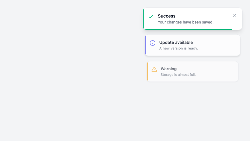
Stacked notification toasts with progress bars and entrance motion.