Feedback
Toast Notification
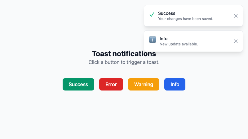
A toast notification system with success, error, warning, and info variants.
by mcpSkills
Framework
nextjs
UI Library
shadcntailwind
Difficultyintermediate
English Prompt
Create a toast notification system with 4 variants: success (green), error (red), warning (yellow), and info (blue). Each toast includes an icon, title, message, and dismiss button. Toasts auto-dismiss after 4 seconds, stack in the top-right corner, and support swipe-to-dismiss on mobile. Use shadcn/ui Sonner or Toast and Tailwind CSS. Provide a demo button panel to trigger each variant.
Chinese Prompt
创建一个 toast 通知系统,包含 4 种变体:成功(绿色)、错误(红色)、警告(黄色)和信息(蓝色)。每个 toast 包含图标、标题、消息和关闭按钮。toast 在 4 秒后自动关闭,在右上角堆叠,并支持移动端滑动关闭。使用 shadcn/ui Sonner 或 Toast 以及 Tailwind CSS。提供一个演示按钮面板来触发每种变体。
## Overview
A complete toast notification system for user feedback. Covers all common states and includes a demo panel.
## Features
- 4 notification variants
- Icons and dismiss buttons
- Auto-dismiss with timer
- Stacked positioning
- Swipe-to-dismiss on mobile
- Demo trigger panel
## Usage
Copy the prompt into v0 or Cursor. Wire the toast triggers into your app events and forms.
## Customization
Modify the prompt to:
- Change position (bottom-center, top-left)
- Add action buttons inside toasts
- Add progress bar countdown
- Persist notifications in a sidebar