Display
Spotlight Card Grid
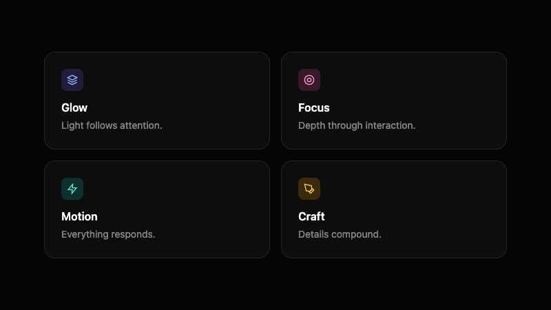
A grid of dark cards where a radial glow follows the cursor, illuminating borders and content.
by mcpSkills
Framework
nextjs
UI Library
shadcntailwind
Difficultyadvanced
English Prompt
Create a 2x2 grid of dark feature cards with a cursor-following spotlight effect. Each card should have a near-black background, a 1px dark border, and a radial gradient glow that tracks the mouse position across the grid, lighting up borders and the area behind the cursor. Use React state to track mouse coordinates and CSS variables to position the glow. Inside each card, place a small icon, a bold headline, and a one-line description in muted gray. The cards should have subtle hover lift. Use Tailwind CSS. No images, focus on light and interaction.
Chinese Prompt
创建一个 2x2 的深色功能卡片网格,带有跟随光标的聚光灯效果。每张卡片使用近黑色背景、1px 深色边框,以及一个径向渐变光晕,它随鼠标在网格上移动而照亮边框和光标后方区域。使用 React state 跟踪鼠标坐标,CSS 变量定位光晕。每张卡片内部放置小图标、粗体标题和柔和灰色的一行描述。卡片应有微妙的悬停提升效果。使用 Tailwind CSS。不要使用图片,专注于光线与交互。
## Overview
An interactive card grid that uses a tracked radial glow to create a sense of discovery and premium lighting.
## Features
- 2x2 dark card grid
- Cursor-following radial glow via CSS variables
- Subtle border illumination
- Icon + headline + description per card
- Hover lift
- No images, light-driven design
## Usage
Great for feature sections, pricing overviews, or capability grids on dark product pages.
## Customization
Modify the prompt to:
- Increase the grid to 3 columns
- Change the glow color based on card position
- Add a glass reflection layer on hover
- Reveal hidden details when a card is highlighted