Navigation
Responsive Navbar
A sticky responsive navigation bar with logo, links, CTA button, and mobile hamburger menu.
by mcpSkills
Framework
nextjs
UI Library
shadcntailwind
Difficultybeginner
English Prompt
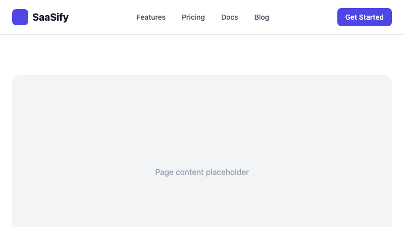
Create a responsive navbar for a SaaS product. Layout: logo on the left, navigation links in the center (Features, Pricing, Docs, Blog), and a "Get Started" CTA button on the right. On mobile, show a hamburger menu that opens a slide-in drawer with the links. Use shadcn/ui Button and Sheet components and Tailwind CSS. Make the navbar sticky with a subtle shadow on scroll.
Chinese Prompt
为 SaaS 产品创建一个响应式导航栏。布局:左侧 logo,中间导航链接(Features、Pricing、Docs、Blog),右侧 "Get Started" CTA 按钮。移动端显示汉堡菜单,点击后滑出抽屉显示链接。使用 shadcn/ui Button 和 Sheet 组件以及 Tailwind CSS。使导航栏固定,滚动时显示微妙阴影。
## Overview
A standard top navigation bar that works across desktop and mobile. Includes sticky behavior and a mobile drawer.
## Features
- Logo + nav links + CTA layout
- Sticky header with scroll shadow
- Mobile hamburger menu
- Slide-in drawer for mobile links
- Responsive breakpoint handling
## Usage
Copy the prompt into v0 or Cursor. Update the links and CTA to match your site structure.
## Customization
Modify the prompt to:
- Add a dropdown mega menu
- Include user avatar when logged in
- Add a dark mode toggle
- Change to a transparent hero navbar