UI Components
Floating Label Input
A text input where the label floats above on focus with subtle underline and validation states.
by mcpskills
Framework
reacttailwind
UI Library
form
Difficultyintermediate
English Prompt
Create a premium floating-label input component on a clean light background. The input has no visible border box, only a 1px bottom border in gray-300. The label sits inside the input as placeholder-style text in gray-400. On focus or when the input has value, the label smoothly animates upward and shrinks to a small caption in indigo-600, while the bottom border thickens to 2px and turns indigo-500. Show three states in a vertical stack: default empty, focused with text, and valid with a small checkmark SVG on the right and green bottom border. Add subtle error state with red border and small error text below. Use smooth transitions, no emojis, no background fills, and plenty of vertical spacing. The typography should feel editorial.
Chinese Prompt
在干净的浅色背景上创建一个高级浮动标签输入组件。输入框没有可见的边框盒子,只有一条 1px 的 gray-300 底部边框。标签位于输入框内部,作为占位符样式的 gray-400 文字。聚焦或输入有值时,标签平滑向上移动并缩小为 indigo-600 的小标题文字,同时底部边框加粗为 2px 并变为 indigo-500。以垂直堆叠展示三种状态:默认空态、聚焦有文字、验证通过(右侧显示小勾选 SVG,底部边框为绿色)。添加细微的错误状态,带有红色边框和下方小错误文字。使用平滑过渡,不使用 emoji,无背景填充,保持宽松的垂直间距。排版应具有编辑感。
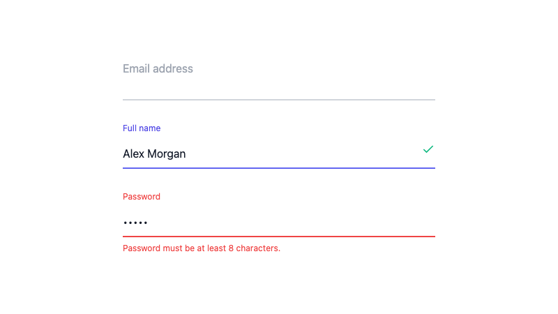
Floating label input with animated label, underline accent, and validation states.