Layout
Editorial Magazine Layout
An asymmetric editorial layout with oversized headlines, generous whitespace, and a magazine-style image composition.
by mcpSkills
Framework
nextjs
UI Library
shadcntailwind
Difficultyadvanced
English Prompt
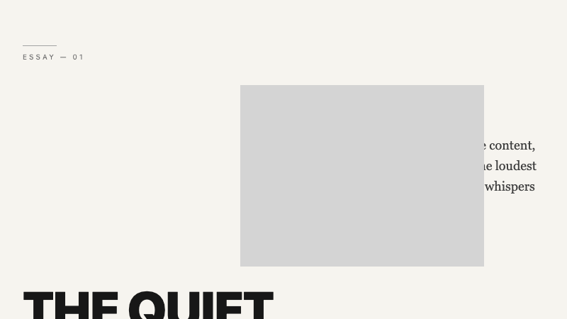
Create an editorial magazine-style layout section. Use a 12-column asymmetric grid: a massive headline spans columns 1-7, a body-text column sits in columns 9-12, and a rectangular image placeholder overlaps the headline at columns 6-10. Use a warm off-white background and near-black text. Typography should pair a bold condensed sans-serif headline with a readable serif body text. Add a small uppercase category label with a thin rule line above it. Whitespace should be generous and intentional. Use Tailwind CSS grid. No borders, no cards, no shadows—only typography, image, and space.
Chinese Prompt
创建一个编辑杂志风格的布局区域。使用 12 列不对称网格:大标题横跨第 1-7 列,正文列位于第 9-12 列,矩形图片占位区在第 6-10 列与标题重叠。使用温暖的米白色背景和近黑色文字。排版应将粗体压缩无衬线标题与易读的衬线正文配对。添加一个小号大写分类标签,上方带细线分隔。留白应充裕且有意图。使用 Tailwind CSS 网格。无边框、无卡片、无阴影——只有字体、图片和空间。
## Overview
A print-inspired web layout that treats whitespace and typographic hierarchy as the main design elements.
## Features
- 12-column asymmetric grid
- Oversized condensed headline
- Overlapping image placement
- Serif body text pairing
- Uppercase category label with rule
- Generous whitespace
- No decorative borders or shadows
## Usage
Ideal for editorial publications, fashion lookbooks, long-form landing pages, or design portfolios.
## Customization
Modify the prompt to:
- Add a pull-quote overlapping the image
- Use a two-tone background split
- Introduce a vertical sidenote column
- Replace the image with a full-bleed video